

| Background |

The Kaohsiung iBus real-time bus information service provides citizens with real-time bus arrival times and route details, making bus travel easier. This project enhances inclusivity by improving accessibility for the elderly and visually impaired and adding personalized features to meet diverse user needs.
Project Goals
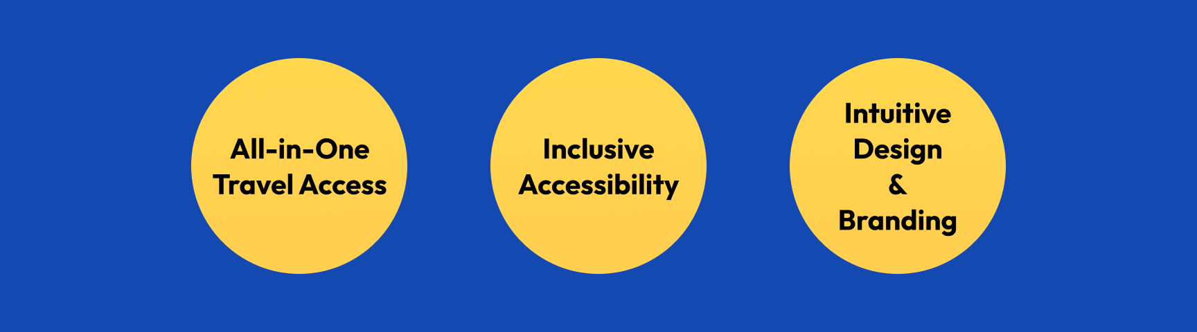
Our goal is to create a seamless transport experience by integrating different services, ensuring accessibility for users of all abilities, and redesigning user flows and brand visuals for a more intuitive and user-friendly interface.
As the sole designer on the project
The project team included: 1 design lead (Product Manager), 1 designer (myself), 1 UX researcher, 12 engineers, 2 project managers, and 4 QA specialists. Bold text highlights responsibilities I took on in addition to shared tasks.
1
Discovery
2
Design & Execution
3
Validation & Iteration
4
Launch & Communication
| User Research & Problem Definition |
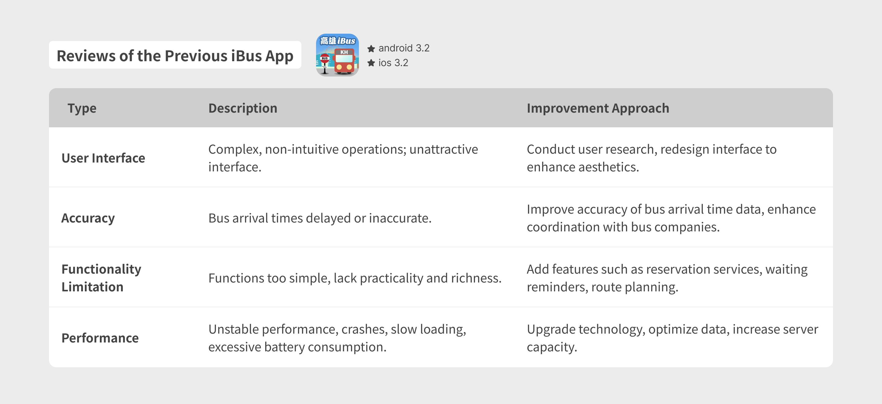
Reviewing feedback from the existing product
We analyzed app store reviews and identified four key user concerns: interface design, accuracy, feature limitations, and overall performance. Based on these insights, we proposed targeted improvement approaches for each area.
Comparative Product Study
To identify what sets iBus apart, we analyzed comparable products, focusing on their features, user flows, strengths, and weaknesses to uncover key differences and industry best practices.
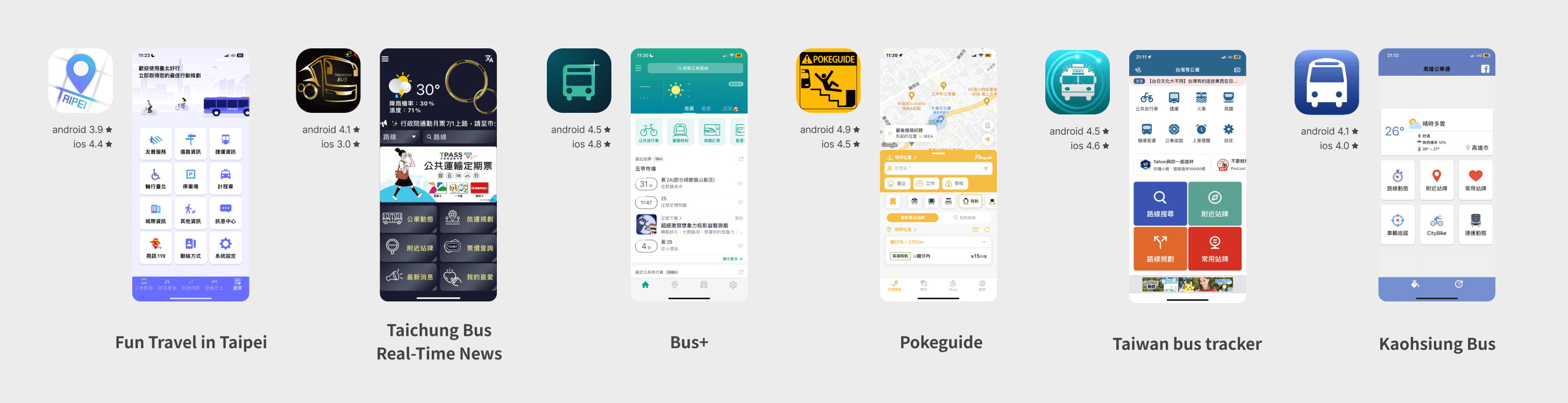
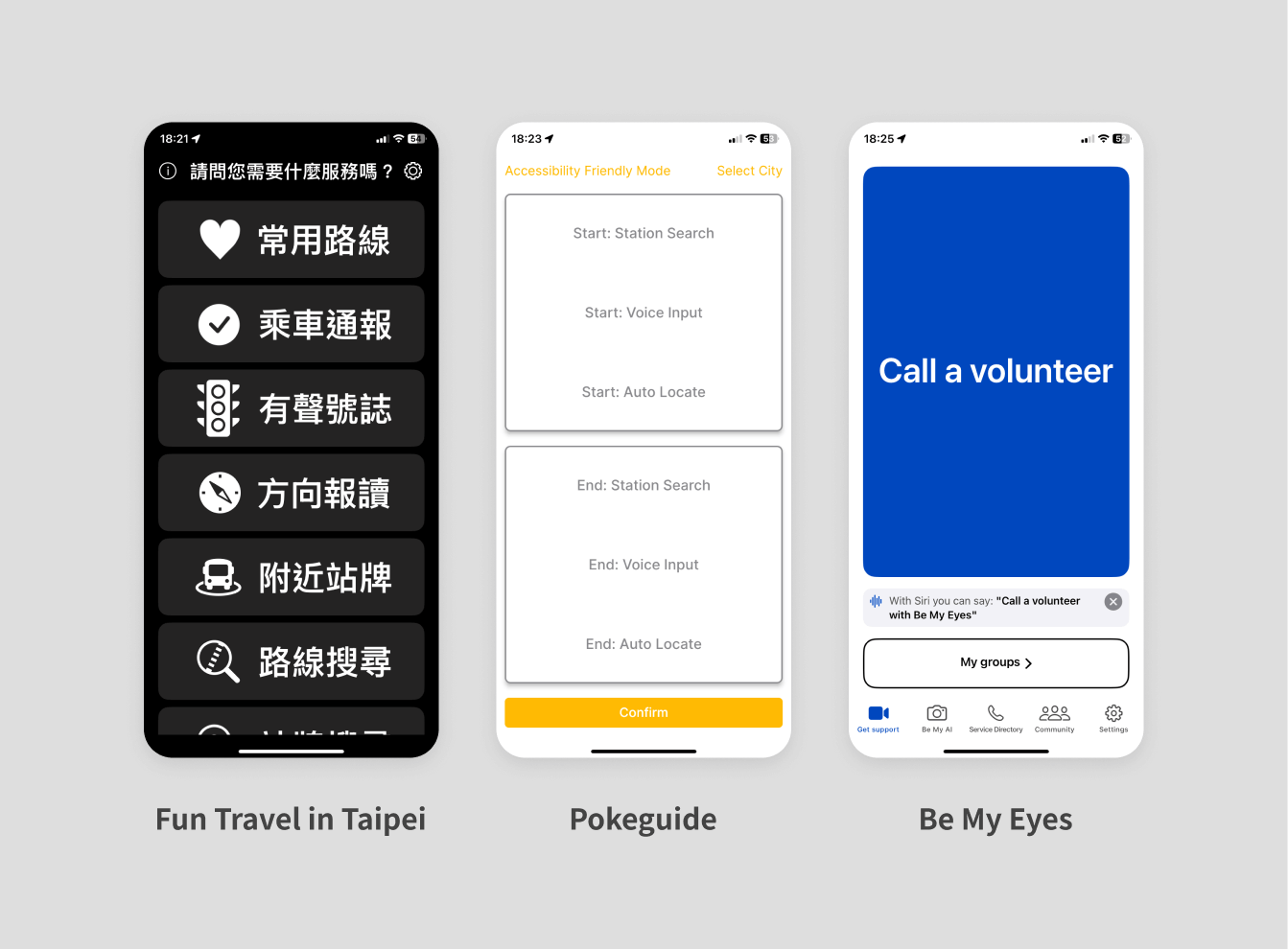
We also paid special attention to the accessibility modes of other products. We found that transportation-related apps rarely offer accessibility support, and those that do often provide limited functionality.
Clearer, More Operable Interfaces
Larger components and high contrast improve tap accuracy and visual recognition.
Streamlined User Flows
Simplified navigation helps users focus on key tasks with less friction.
Screen Reader–Friendly Content
We tested voice output and refined alt text to ensure clarity for assistive tools.
Usability Testing
We conducted usability testing using the updated initial design, inviting users from different backgrounds to evaluate whether the product’s features, user flows, and component recognizability met their needs and expectations.

Below are our target user groups and their key product needs:

Requires large font sizes, large buttons, and a simple, intuitive interface to facilitate easy use.

Needs a voice reading function to provide product structure information and transportation updates through the audio content.

Focuses on the accuracy of transfer information and transportation details to ensure smooth travel plans.
Research Summary
These research insights align closely with the optimization goals proposed by the Kaohsiung Transportation Bureau.
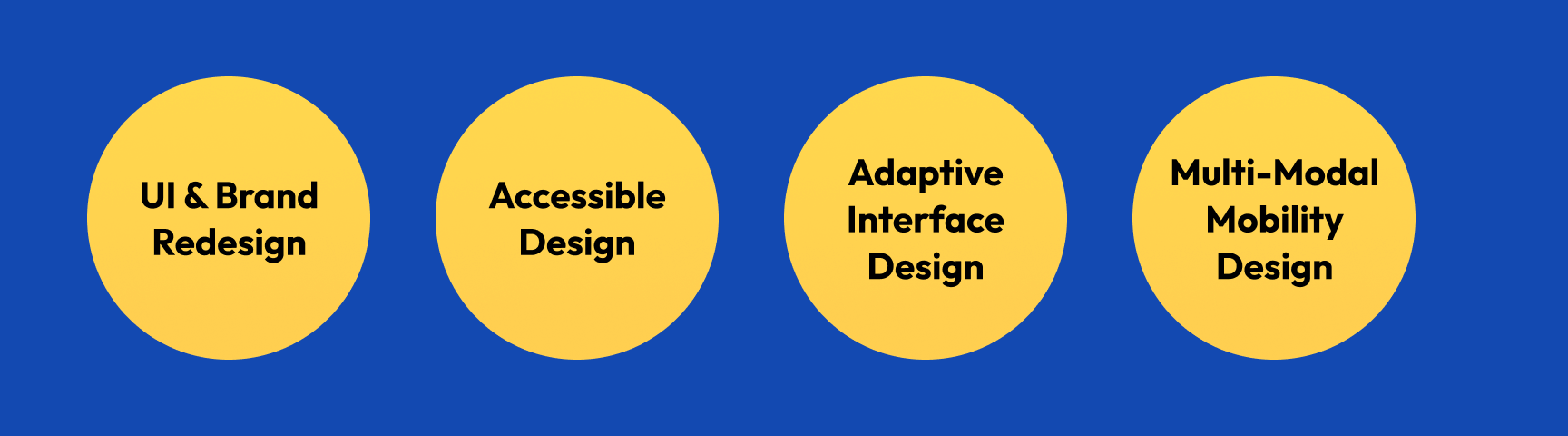
UI & Brand Redesign
A refreshed interface and brand system improve usability, consistency, and overall product perception.
Inclusive by Design
Designing with accessibility in mind not only improves usability, but also differentiates the product from competitors.
Personalized Experience
Enhanced personalization features allow users to tailor the product to their needs, increasing relevance and engagement.
| What Else Did I Do? |
The diagram above shows our project workflow. White labels indicate tasks shared with the team, while yellow bold labels highlight responsibilities I handled independently.
1/ UI & Brand Redesign
Redesign for Better User Experience
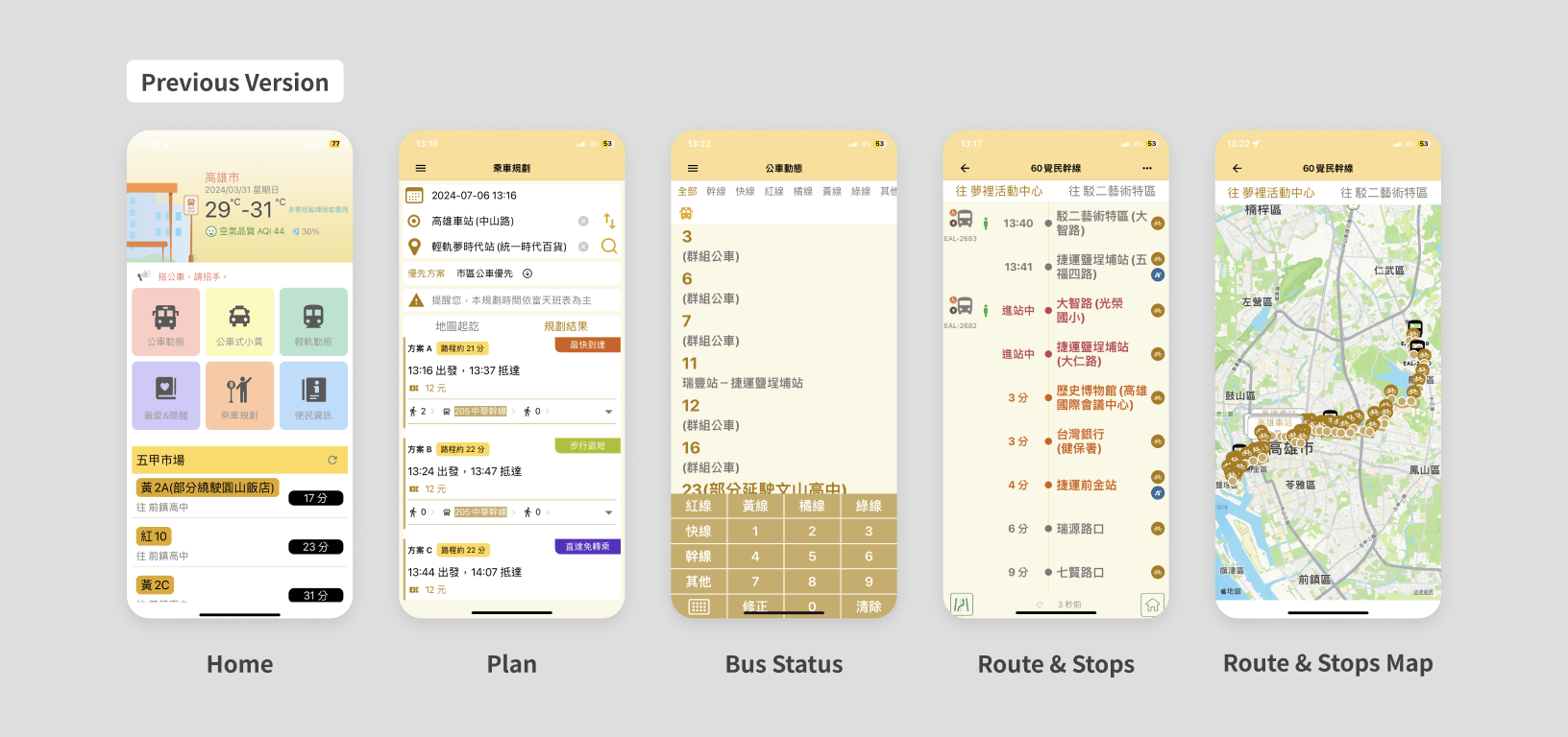
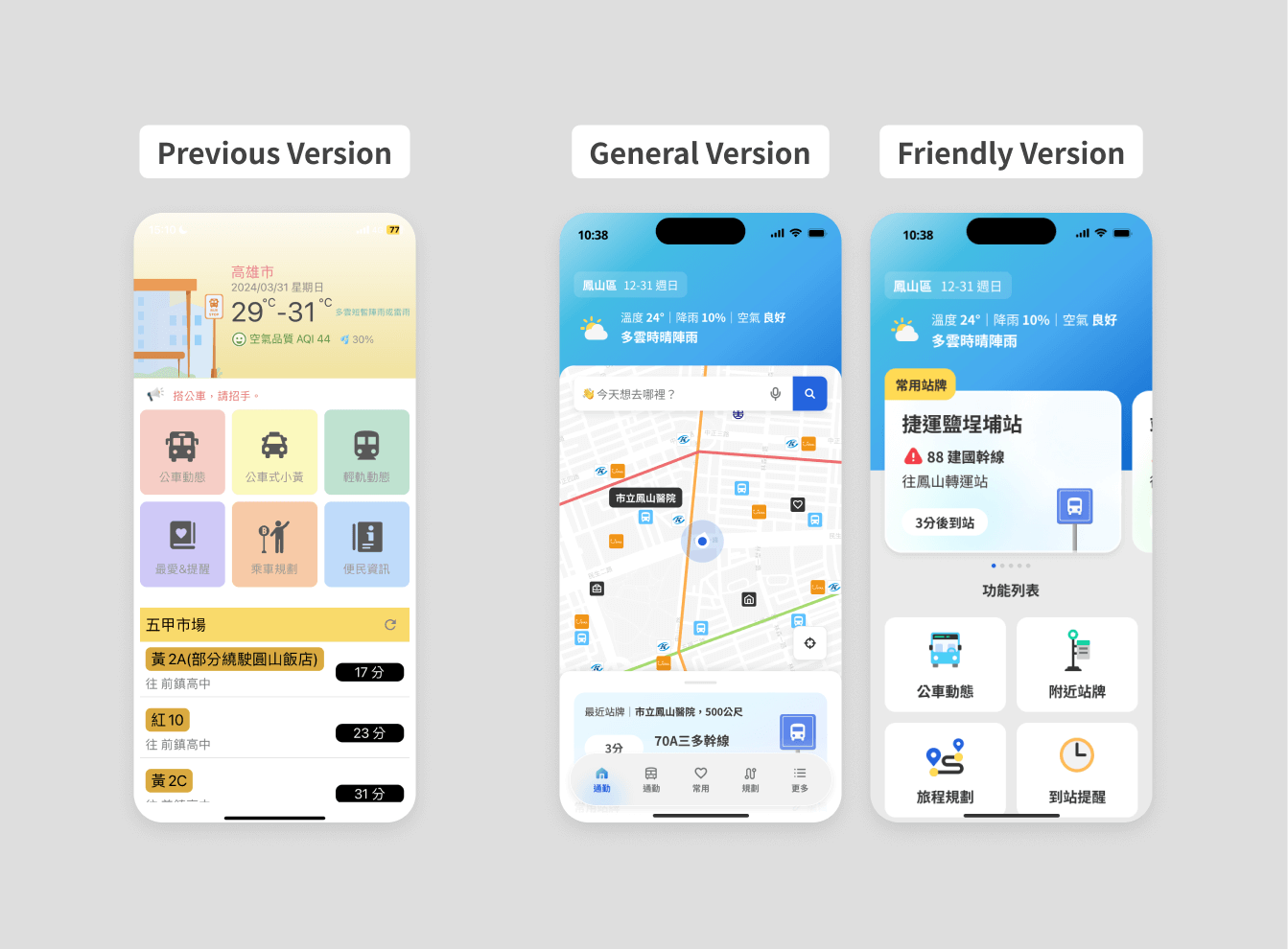
Preliminary research showed that users found the old iBus interface outdated, unintuitive, unattractive, and complicated. As the sole designer for iBus, I was responsible for all interface and visual design. I independently designed the entire product, including two app versions with dark and light modes, and a responsive website. Usability testing found the new app interface cleaner, more modern, and intuitive, with imagery and block design for easier understanding.


Visual Identity Alignment
I evaluated whether the use of color was consistent and effectively aligned with the visual identity of Kaohsiung.
Text Legibility & Contrast
I assessed the contrast and clarity of text content to ensure readability across various use scenarios.
Information Hierarchy & Grouping
I analyzed the clarity of the information hierarchy and whether the grouping of content was easy to recognize and navigate.
Accessible Website Design
The website was designed to comply with WCAG AA accessibility standards, ensuring that content is perceivable, operable, and understandable for users of all abilities. This included considerations such as color contrast, keyboard navigation, and screen reader compatibility.

Click Button to access the new iBus Website!
iBus WebsiteAbout the New Brand
With my extensive branding experience, I led the design, drawing inspiration from Kaohsiung, a vibrant coastal city in southern Taiwan. I chose a warm yellow and aqua-blue color scheme, reflecting the city's energy and warmth, and used playful 3D illustrations to create a lively and dynamic atmosphere for iBus. Photo by Kaohsiung Tourism Bureau.

Friendly Accessories
I'm also responsible for designing the friendly identification symbols as well. The rounded heart shape, paired with a bright and warm yellow, along with gentle slogans, aims to promote greater social inclusivity and understanding through this cute imagery and symbol. We've created user-friendly identification signs to enhance the commuting experience for visually impaired individuals and promote social inclusion. These signs allow staff and passengers to recognize and assist visually impaired individuals, improving their travel quality and efficiency.

🫶 The new brand style feels more modern and visually energetic, and the app interface looks much cleaner!
2/ Designing for Screen Reader Users
During the process of merging the two versions, special attention needs to be paid to the placement order of the components, as the positioning can affect the reading order.
What Happen?
To maintain interface consistency between the friendly and general modes, despite differing text sizes and layouts, efforts will minimize differences in button placement.
In Fact
In the general mode, route information is presented using a drawer with navigation buttons fixed at the bottom. However, in the friendly mode, we avoid using drawer components due to potential accessibility issues with screen readers. Instead, we place navigation buttons above the route information. This allows quicker access to navigation mode while reading, unlike the general mode where users must finish reading all route details before navigating.

Another example is the station timetable. In the general mode interface, the schedules for weekdays and holidays are fully displayed together. However, in the screen reading system, it reads all the weekday times first before starting to read the holiday times. To help visually impaired users quickly find the times they need, we have made a more user-friendly version where the weekday and holiday times are collapsed. Initially, only 9 sets of weekday times are displayed, and users can choose whether to continue listening to more.

The friendly mode serves visually impaired users, where reading order typically proceeds from top-left to bottom-right. Therefore, interface design carefully considers component placement. For instance, in the friendly navigation, pages beyond the second level include a "Return to Homepage" button beside the back button. This feature assists visually impaired users in reorienting themselves within the product structure.

Why Simplify Processes and Information for Friendly Version?
In the friendly version simplifies processes and information to enhance usability, reduce the learning curve, and improve efficiency. It minimizes confusion and errors, increases accessibility for users with varying abilities, and highlights key information. This design also reduces cognitive load, allowing users to focus on essential tasks.
As shown in the video on the left, you only need to click a few times to complete the task. The images below show the interface differences between the General Version and the Friendly Version across several screens.


🫶 The updated app uses images and a block-based layout, which makes it easier to understand. The integrated information also helps me find what I need more quickly.
3/ Flexible Visual Settings
Optimizing Accessibility: Dark and Light Mode
As a government collaboration project, iBus must meet policy compliance and accessibility standards. The new iBus design includes light and dark modes to enhance user experience. I developed these modes with a focus on improving accessibility for the elderly and visually impaired, ensuring that color choices and font sizes in dark mode meet accessibility standards for better readability and comfort.

Dark Mode Challenges
Maintain brand style and color consistency while ensuring element recognition and readability. Avoid making the interface appear broken or elements look disabled during color testing.
Using the yellow boxed area (bus arrival status) as an example, which color combination is clearest and easiest to identify while meeting accessibility standards? Testing determined that Option A was best, as its distinct status allowed passengers to recognize the bus arrival more quickly.

Meet needs: Accessible Font Size and Color
Based on previous research and usability testing, the new version of iBus has met the needs of various user groups in terms of color and font design:
Clearer and More Understandable
Require larger fonts and buttons. Use at least 18pt font size and offer multiple size options for easier operation and recognition. Research showed that larger, clearer buttons and text are needed for elderly and visually impaired users. Therefore, in the Friendly Version, we enlarged text, images, and buttons to enhance readability and usability.

Font size design requires careful attention. As shown, I specify font height, weight, and size in the component library and check for layout issues when switching font sizes.


Dark Mode Contrast
Ensure a 4.5:1 contrast ratio between text and background in dark and light mode, meeting WCAG AA standards.

🫶 It's easier to recognize the content within buttons—everything is clearly displayed and easy to read.
🫶 I really like the dark mode, and the ability to switch interfaces based on personal preference makes it more user-friendly.
4/ Transport Map Integration – No More Tool Switching!
Multiple Maps at One Stop
From previous research and interviews, we learned that users often use other apps for assistance, such as Google Maps, because iBus cannot accurately pinpoint their location, they frequently rely on Google Maps to determine routes and directions. However, they do not use Google Maps exclusively because they believe that iBus, as a government-provided product, offers more accurate information regarding transit times and fares. Additionally, Users also hope the new iBus will integrate dynamic data for other transportation modes, like metro and light rail, with its map functionality.

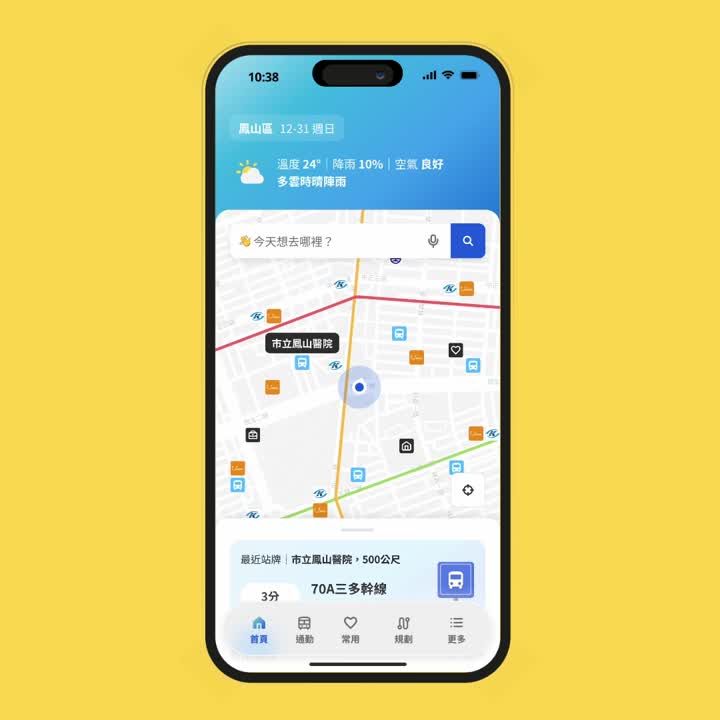
Integrating Transportation Resource
In the new design, I referenced existing products, gathered extensive data from transportation websites, and analyzed user needs. I created various transportation maps to offer comprehensive and accurate information, helping users plan and manage their travel more easily. These maps feature detailed routes for buses, metros, and light rails, and include real-time data for the latest traffic conditions and schedules.
As shown in the prototype on the left, tapping the "Info" tab allows you to choose between bus or metro/light rail updates. After selecting metro/light rail, detailed information such as nearby station times, first and last train schedules, station facilities, and vehicle crowding levels will be displayed.
Meet needs: Get Information Faster
Most Users
Provide various transportation data and add quick access to frequently used stops on the homepage, allowing users to easily retrieve information without searching or multiple clicks. In addition to buses, include light rail, metro, and YouBike in the frequently used stops list.


General Commuters
The new iBus offers more detailed transportation information, allowing users to find nearby transfer options on the map. To address users' confusion about bus routes and directions, I designed bus icons with directional indicators on the route map to help users quickly identify the direction of the buses.
While designing light rail and metro maps, it was found that open-source data can provide waiting times and information on station exits, such as elevators, restrooms, and nearby intersections, all accessible through iBus.


🫶 I’d love to see more details for other public transportation options. It’s super convenient not having to switch between different tools!
🙏 I look forward to seeing AI-powered customer service in the future, with real-time, interactive support—not just canned responses.
Challenge 1 : Mismatched Information
What Happen?
During the data integration process, engineers have observed occasional information errors. For example, pricing information for transportation vehicles may sometimes be missing, or it may appear with correct or incorrect details.
Solution
The conclusion of our discussion is that if the data shows a price of 0, we won't display specific pricing details. Instead, we'll offer an external link for users to view detailed "price information." If available, we'll include a note stating "Price information is for reference only" nearby. This approach aims to prevent potential issues caused by displaying free information, which can be more problematic than displaying incorrect prices. It helps reduce complaints related to this issue.
Generally, in data integration, if we fail to receive data correctly, we choose to hide that information. Simultaneously, when providing the data, we include a note stating "Information is for reference only."

Challenge 2 : Different Engineers Have Different Habits
What Happen?
Different engineers handle iBus features, and not all use the component library, leading to inconsistent component designs. For example, the Tab component varies across functions and interfaces, and the Friendly Version uses styles and font sizes from the General Version.

Solution
Carefully compare the test device with design drafts, clearly marking differences and potential solutions, or discuss issues in meetings. For example, I compare screenshots with design drafts, noting component spacing and font sizes, and explain handling extreme cases like excessive text, to quickly resolve problems.
How Do I Collaborate with Engineers?
Finding Examples
We search online for reference materials to assist engineers in adding dynamic elements to the interface, believing visual examples are clearer and quicker to understand than verbal descriptions.
Design Validation
During design validation, we compare device screenshots with design drafts. Adjustments are listed clearly, and an Excel sheet tracks fixes, dates, versions, issues, priorities, responsible persons, and links to comparison screenshots. Engineers appreciate this method for identifying and resolving issues promptly.


Design Adjustments
Of course, there may still be adjustments needed after engineers complete development. However, directly requesting changes to features already implemented can be frustrating for both parties. Therefore, in our communication, we ensure engineers understand the reasons behind adjustments. For example, user testing results may show a preference for a particular version. Building and maintaining good relationships is crucial in our collaboration.

| Feedback |
During the execution of the project, we organized multiple workshops, usability tests, and sharing sessions. Each interaction with users provided us with immense energy and valuable knowledge. By observing their operations and listening to their feedback, we gained clearer insights into the directions and goals for product optimization. Almost every event received highly positive feedback from participants, who are eagerly anticipating the product’s launch.
iBus is a key project in collaboration with the Kaohsiung City Transportation Bureau. In the past, iBus has achieved a total of 100,000 downloads, with around 7 million monthly users on the web and app, and an active user base of about 10,000 to 20,000. Based on these figures, we anticipate that the new version of iBus will attract even more users, with the total downloads expected to reach 200,000 and a 50% increase in active users. This will enable us to better serve the residents of Kaohsiung City and enhance the overall transportation experience.


iBus has also gained international recognition, winning multiple prestigious awards, including the Red Dot Design and Good Design Award. This accolades highlight iBus's excellence in design innovation, functionality, and user experience, further establishing its position as a leading transportation app.

iBus Wins 2024 Good Design Award 🎉
Good Design AwardiBus Wins 2024 Red Dot Award 🎉
Red Dot Award| Takeaway |
What is good design?
I gained tremendous insights from this project, especially in inclusive design. It catered to the general public, visually impaired, and elderly users, requiring us to be mindful in our planning and design.
Participating in this project provided invaluable experience, prompting me to reflect on the necessity of design in meeting human needs. Through in-depth interviews and usability testing, I realized that design is no longer just about interfaces and services—it embodies care, understanding, and empathy. Good design can genuinely improve people's lives and create a more user-friendly environment for diverse groups with varying needs.
We considered different users in every detail, from alternative text and gesture controls for the visually impaired to larger interfaces and simplified operations for the elderly. We also integrated voice input and personalized options, which users highly appreciated.
This project enhanced my professional skills and deepened my understanding of design. I believe design can change the world, bringing convenience and warmth to more people. This experience fills me with confidence and anticipation for future design work.
